Ratio Modern Font Family
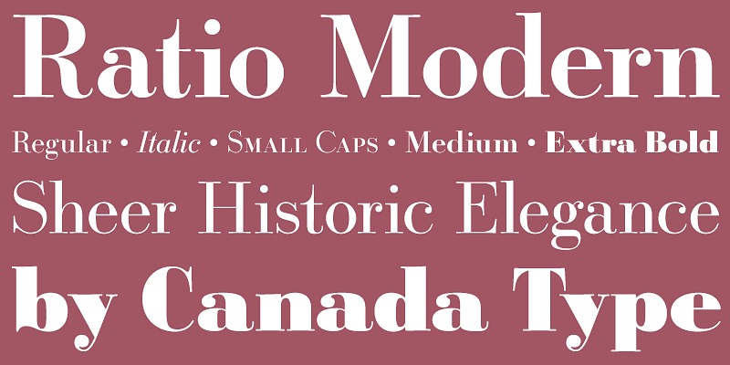
Ratio Modern Font Family is a flexible and reliable font created to fit multiple design needs, from branding and packaging to social media and editorial layouts. . Designed in 1923 by Friedrich Kleukens for the Stempel foundry, Ratio was one of the first metal faces to bring the Didone genre to the forefront of industrial mass publishing as a headline and magazine face. Though essentially modern in construct, Ratio incorporates some old-style and transitional traits, managing to summarize the European evolution of this particular aesthetic. This is evident in its shaped serifs, soft roundings, an elegantly subdued italic, the variation of its shapes between weights, and the obvious fat face influence in the ExtraBold. Thus Ratio finds the balance between modern elegance and fine typographic tradition.This exclusive digitization expands on the original metal set by including small capitals and many alternates in all the styles. It also boasts a larger than usual linguistic support.
Free Trial/ Demo Version. You are welcome to download this font for PERSONAL USE at no cost; however, for those who require the complete typeface package, commercial permissions, or any extended usage rights, the designer has made all licensing details availabl e through the official link. We extend our gratitude to the creator for sharing their work with the community. Access it here: https://fonts.adobe.com/fonts/ratio-modern
Font Information
Designer: Friedrich Kleukens, Kevin King
License: Demo / Trial
File: ratio-modern-font-family.zip