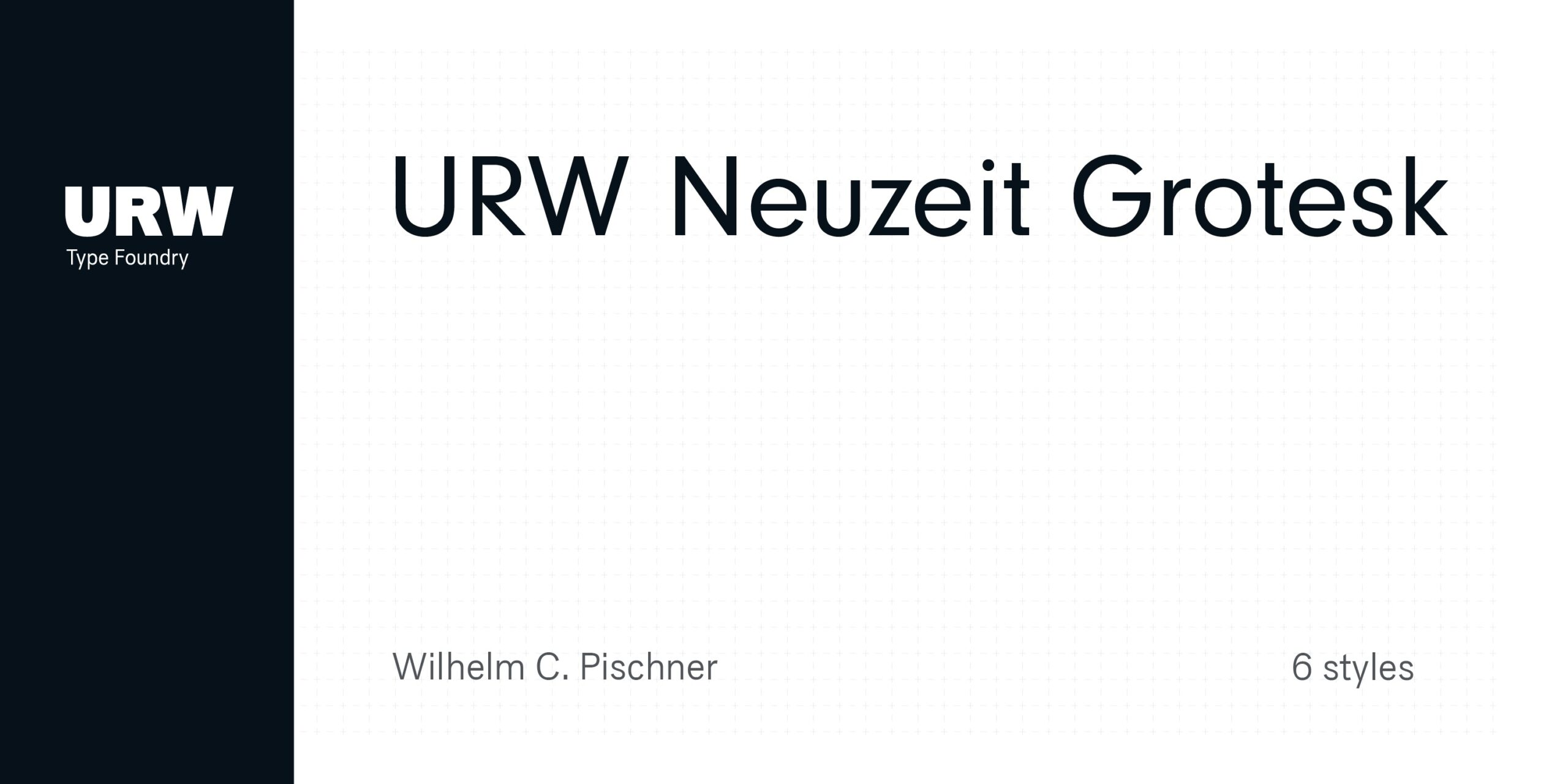
Neuzeit Grotesk Font Family
Neuzeit Grotesk Font Family is a versatile font designed to adapt beautifully across different design styles, offering dependable readability and balance. Neuzeit Grotesk was originally designed by Wilhelm Pischner (1904-1989) and was released by the font foundry D. Stempel in 1928-1939. In 1970, the German Standards Committee advised the standard use of Neuzeit-Grotesk for official signage and traffic directional systems, and the abbreviation DIN was added to the name of the font. DIN” stands for Deutsches Institut für Normung (The German Institute for Industrial Standards). Neuzeit Grotesk was also once the standard in the German printing industry.
It has been seen as a straightforward and utilitarian typeface, with no unusual or distracting features. Like other typefaces from the 1920s, it
reflects the philosophy of those times, “Form is Function.” Today, however, because of its familiarity and practicality, Neuzeit™ Grotesk has acquired an almost cheerful and reassuring aura.
Try it out for signage, magazine headlines, or flyers. See also Neuzeit S for text weights of Neuzeit Grotesk.
Free Trial/ Demo Version. You are welcome to download this font for PERSONAL USE at no cost; however, for those who require the complete typeface package, commercial permissions, or any extended usage rights, the designer has made all licensing details available through the official link. We extend our gratitude to the creator for sharing their work with the community. Access it here: https://www.myfonts.com/collections/neuzeit-grotesk-font-urw
Font Information
Designer: Wilhelm Pischner
License: Demo / Trial
File: neuzeit-grotesk-font-family.zip