Naste Font Family
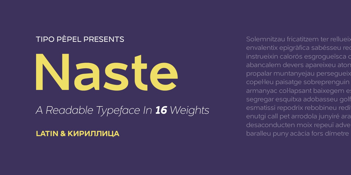
Naste Font Family brings a balanced structure and contemporary look, making it suitable for both digital and print design. . Tipo Pèpel strikes again with a lush splurge on pure basic geometrical shapes and sizes, those that inspired Paul Renner’s typographic milestone “Futura”. A new look to classic shapes, bringing them back plenty of delightfullly details as the lowercase cursive forms’ long tiles that break the supposed linearity expected from a purely geometrical font. Rhythm given by hidden details in each character of each weight, push “Naste” out of German geometric sobriety, will help us to easily create typographic hierarchies upon the many weights available and the many and accurate details. Excellent results with minimal effort. Wide ‘x’ height, restrained ascending and descending stems; thick but elegant, easy to read and in need of generous white space around, where it feels comfortable. More is better than less. As usual in Type Pépel, full sets of Opentype alternatives and Unicode support for 104 languages plus Cyrillic. 16 weights of typographic beauty in all its glory.
Feel free to download this font for PERSONAL USE, but if your project requires commercial licensing, additional weights, or full-feature access, the designer provides comprehensive details and purchase options on their official website. We sincerely thank the author for their creativity and contribution. Visit the source here: https://www.myfonts.com/collections/naste-font-tipo-pepel
Font Information
Designer: Tipo Pèpel
License: Free for Personal Use
File: naste-font-family.zip